With every step we take, in every space we live, work, or walk through, colors influence us in ways we often don't even consciously realize. In the modern world of design — from interiors to graphics, from fashion to technology — color psychology has become a powerful tool for shaping our feelings, experiences, and behaviors.
Today, more than ever, the choice of colors is not simply an aesthetic matter: it is a strategic act that deeply influences the atmosphere, emotions, and message that a space or product conveys.
1. Why do colors have such a powerful impact?
Colors communicate directly with our emotions, through very old neuropsychological pathways:
- They can calm or incite tension,
- Can awaken creativity or enhance concentration,
- They can create feelings of warmth and intimacy, or give an impression of distance and professionalism.
- Studies show that 90% of spontaneous purchasing decisions can be influenced solely by color and the perception it creates.
2. The emotional meaning of colors in design
Here are some of the most common influences that colors have on modern design:
Red
The color of passion, energy, and urgency. Used to attract attention or encourage quick action.
Yellow
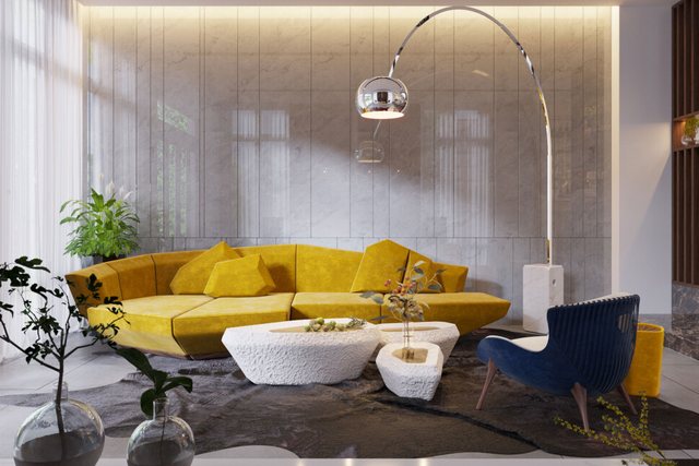
It expresses joy, optimism, and warmth, but in large quantities it can create feelings of anxiety.
blue
The color of calm, trust, and stability. Often used in sectors such as technology and financial services.
Green
Symbol of nature, growth and health. Used in design to evoke freshness, rebirth and sustainability.
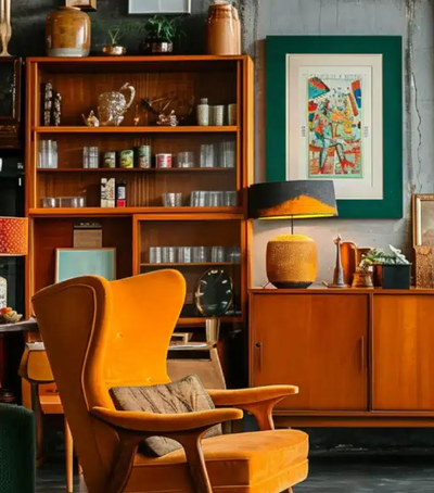
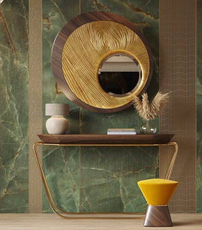
orange
It inspires enthusiasm, creativity and dynamism.
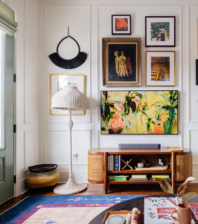
White
It reflects purity, simplicity, and clarity. It is often chosen in minimalist design.
Black
It exudes sophistication, luxury, and authority. Used strategically, it conveys weight and seriousness.
In modern design, the combination of these colors creates sophisticated and multidimensional emotions.
3. Colors and Environments: How They Shape Our Spaces
In interior design and architecture, colors are one of the key elements to define:
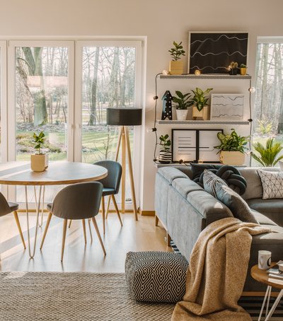
- The perceived size of a space: Light colors like white and pastels visually expand, while dark colors like blue or deep green make the space feel more intimate.
- Emotional atmosphere: An environment with warm colors helps create a welcoming and energetic atmosphere, while environments with cool colors are more calming and reflective.
- The purpose of the space: Offices use colors that stimulate productivity and clarity (like light blue), while living rooms and bedrooms use tones that promote relaxation and comfort.
4. Color Psychology in Brands and Visual Communication
The most successful brands understand the power of color:
- Coca-Cola: Red for energy and passion.
- Apple: White for innovation, simplicity and purity.
- Spotify: Green for freshness, energy, and endless accessibility.
In modern visual communication, color is the first element that creates an intuitive connection between the consumer and the product, before logic intervenes.
In an increasingly crowded market, choosing the right colors can make the difference between an experience that is forgotten and one that remains in the mind and heart.
5. Modern trends in the use of colors
Several key trends are being observed in contemporary design:
- Calm and natural colors: Earth tones, beiges, soft greens, and natural blues are on the rise, reflecting a demand for tranquility and a return to nature.
- Bold contrasts: Dramatic combinations like black with white, or red with pink, to create a powerful visual impact.
- Personalized colors: Brands create unique color palettes to increase recognition and convey specific emotions.
Colors are the invisible language of feelings. In every environment we create and every message we convey, colors are silent but powerful collaborators. In modern design, knowing the psychology of colors is no longer a luxury — it is a necessity to build spaces, products, and experiences that speak, inspire, and touch hearts. Because after all, a well-chosen color can change not only a space, but also a feeling, a day... a life.